Daedmi Review - The best home videos are hereIn what ways does your media product use, develop or challenge forms and conventions of real media products?
I have tried to leave the whole idea of my film wide open. I wanted to leave the viewer to their own interpretation, especially with the ending where I have given so many roads to lead the viewer down. I have stuck with some simple conventions like the film noir convention of being in black and white, I have taken this idea from films like ‘The Killers’ which was very effective, when the film was converted to colour I felt that it did not have the same feel to it, which I think black and white gives to film noir has. I have stayed with same conventions but also gone against some conventions with the camera shots. Like for instance I have gone against the
How effective is the combination of your main product and ancillary texts?
I believe the review and poster have a perfect fit to my film. In my poster I wanted to give the sense that the film was very strange and eccentric. I showed this by having the main picture upside down to make the viewer question why. The poster is very simple but asks lots of questions, which I think attracts people to see films, because you want to know whom the girl is? Why is she upside down? Why is the girl there? And so on. My review is plain and simple and follows all normal conventions of a good review. I have tried to aim my review at all ages and classes, by being over exaggerated and tell the reader how it is, but also using a little of high class comical writing. These ancillary texts will attract many people to see my film, I have shown people my poster and they think that it looks quite surreal and want to ask questions, so that the answers could be found in the film, which is what I wanted to do.
What have you learnt from your audience feedback?
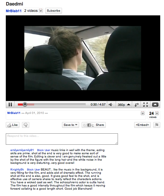
I used different ways to get my audience; first of all I tried the web 2.0, approach by posting the film on youtube, which didn’t really work because I didn’t get any comments back. I then tried making a link from youtube to facebook, which was successful; I got comments on youtube and facebook. These comments were very positive; the main point raised that was positive was that the music used was very effective, which I really worked hard on, and I think that the music really makes the film stick together. Another positive point raised is the camera shots used. Was very imaginative and eccentric. I really wanted to try and use shots that go against the conventions like slanted shots and going against the 180-degree rule. The only negative point to come out of basically all of the comments, were that it was very complex, and difficult to understand and basically some people did not know what happened. But this is what I wanted to achieve, I wanted to answer a question with another question.
How did you use media technologies in construction and research, planning and evaluation stages?
I used many different types of technologies to help me with all different types of my film. Like for instance getting ideas for my film in the research stage I used ‘Youtube’ to research short films and what they meant to be like. I got quite a lot of ideas from there; I also used other sites where short films are uploaded like ‘Depict’, ‘BBC film network’ and ‘Pixar short films’. Watching these short films gave me an idea of what short films are meant to be like, which gave me the idea of asking more questions than giving answers. On the planning stage I used sites like ‘Blogger’ to collect and present my work to the world. I also used ‘Taking It Global’ to help me get more ideas for my film by posting a question. I got a couple of answers back, but nothing that I was looking for. In the evaluation stage social networking and ‘Youtube’ helped me quite a lot with my audience feedback. I posted the film onto ‘Youtube’ and made a link to ‘Facebook’ I managed to get a lot of comments back. Through out the whole process, I have been using ‘iMovie’ I build my film and the Internet to answer any questions that may need answering. So media technologies and web 2.0 are a massive help when constructing and planning your film, and I am glad we are able to have and use it.
9 Shots
1st shot – validation
I have gone with the film noir genre because I think it’s a genre, which is not fully credited for and is a dying genre. The only modern film noir film I can think of is ‘Sin City’. I think film noir is a good genre and can use any storyline like the one I have used and ‘Sin City’. I have chosen the link these shots because they are very similar and the short film ‘Validation’ is one of my inspirations, and is the main reason why I went for the black and white film, then leading into the genre of film noir.
2nd short - INSiDE
This is one of my favourite shots and I didn’t even know that it is the same shot as one of my favourite and most inspiring short films ‘INSiDE’. In my shot I have a schizophrenic who can hear Noah. While in the short film ‘INSiDE’ the main character has a multiple personality disorder, so these shots are more linked than I ever though which is very strange.
3rd shot – The Killers (black and white)
This shot if very effective because I think I used the rules of thirds very well, and makes jack seem like he is actually by himself and the Noah is in his head talking to him. This is the film that made me go from black and white, into the genre of film noir.
4th shot – strangers
This shot looks into the character very well and shows his personality and innocence in just that shot. I really like this shot because his whole face is tilted up including his eyes, but the camera stays straight. I wanted it to look like the character was praying almost, but the camera shot points straight at him and not following up insists that nobody is listening.
5th Shot – The Killers (In Colour)
In this shot I have a character in the foreground and a character in the background; I have tried to link this from a film noir genre film. Called the killers it’s a really intresting shot because it gives two stories, Noah’s story and Jacks story, just in one shot. The body language from each other shows what their life is like and that does jack actually see Noah in the film at all because he has his head down not paying attention. I chose this shot from the killers because it is quite similar where the shot also tells 2 different shots.
6th shot – The Shining
This shot was really inspired by the flash that the little boy had in the shining where he saw the two girls. I really like it because I have tried to make it stand out by having the shot in colour, like a kind of access to the real world.
7th Shot – night of the living dead
With this shot I tried to link two inspirations together. The shot I had already shown from the shining and the shot coming up from night of the living dead. I think it’s really spooky because with the amount of time I gave the shot it can only be seen as a dark mysterious figure
8th shot - Lovefield
I really like this shot because it makes the viewer feel restricted and under threat because the angle is low looking upward. It’s putting the viewer in the characters position. But the way I have meant to use it, is to still fear the scene but not on the approaching danger, but for the mystery to be uncovered. This shot has been used in the short film ‘Lovefield’ where they used this shot to give fear to the man coming.
9th Shot - Cloverfield
This is one of my favourite shots because it’s not a normal shot have. I wanted to give off a sense that his whole world had been rocked and that nothing is the same anymore. This shot is similar to a shot I saw in cloverfield where it is through a hand held camera, but I have not gone that way. The shot is also of a similar use in cloverfield where the whole world has been worked by the attack.